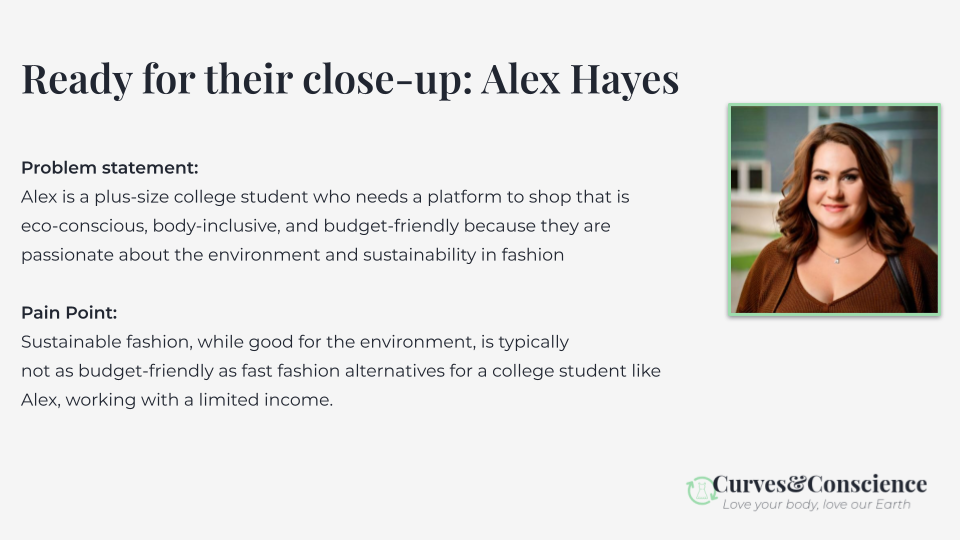
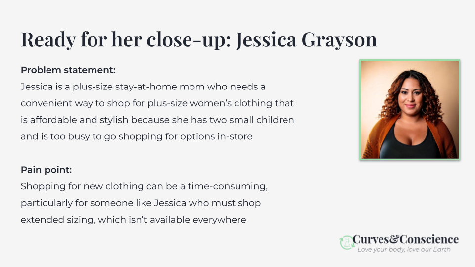
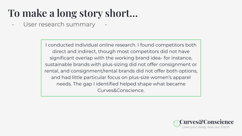
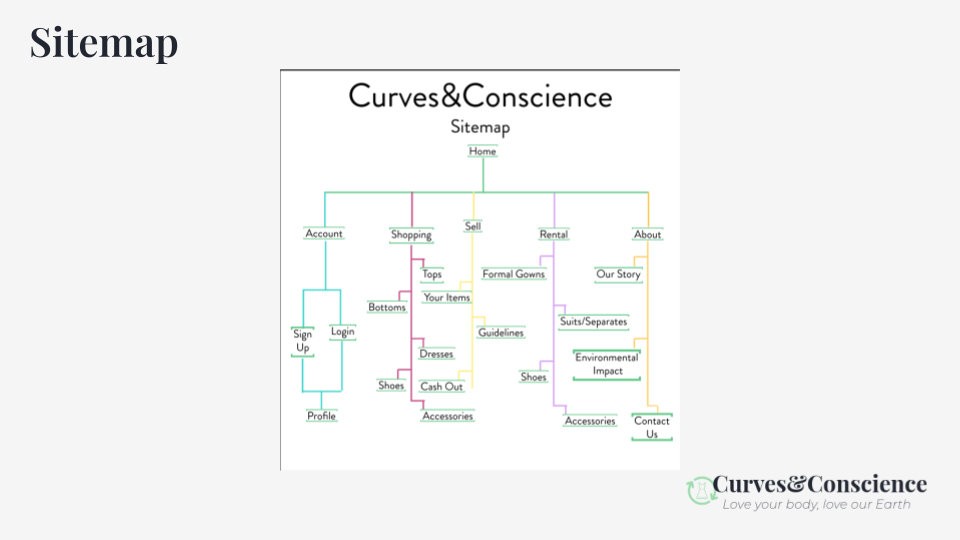
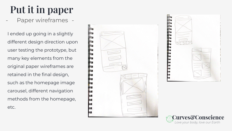
Project Background
Overview for Curves&Conscience, a mobile web app for plus-size women's apparel rental and resale. On this project, I served as Lead UX researcher and designer, conducting user research, wireframing, prototyping, and testing from May 2024 to July 2024
Curves&Conscience aims to solve the issue of lack of sustainability in the fashion industry, specifically focusing on affordability and sizing for larger bodies through the ability to rent/buy/and sell gently-used apparel
User Research
Persona for Alex, a plus-size college student with a limited budget and a passion for sustainable fashion
Persona for Jessica, a plus-size mom looking for a convenient way to find affordable and stylish clothing that fits her body
User pain points, including: Lack of inclusive sizing, lack of environmental sustainability, lack of affordable options, and having to choose between consignment or rental
Empathy map for Alex, showcasing their thoughts, feelings, words, and actions
Empathy map for Jessica, showcasing what she says, thinks, does, and feels
Introduction to Alex's user journey
Alex's user journey, depicitng the process of buying an item on Curves&Conscience
Introduction to Jessica's user journey
Jessica's user journey, showcasing the process of making and returning a rental
User research shows competitors both direct and indirect, but  with little significant overlap with the working brand idea for Curves&Conscience
Beginning the Design
Sitemap for Curves&Conscience
Paper wireframes, showing initial design ideas
Digital wireframes, expanding upon the design ideas in the paper version
A closer look at key features from the digital wireframes, including an image carousel feature on the homepage, nav buttons, and a hambruger menu
View/download the digital wireframes here
The low-fidelity prototype, focused on core functionality and navigation, linking key pages and setting the baseline for essential user flows
View/download the low-fidelity prototype here
Refining the Design
Usability study findings indicate in round one a need for reliable navigation back on each page, change to the placement of the main menu, and inclusion of vertical scrolling. Round 2 indicates a need for additional white space on some screens, clearer indication for buttons/links, and clearer division of some content
Mockups adding content, and giving a view of the brand voice and look, with brand colors, logo, and typography all implemented in this iteration
View/download the mockups here
Shows the change in menu placement/display following suggestions in the usability study
Curves&Conscience sticker sheet
The high-fidelity prototype, adding a number of new screens and features, as well as additional user flows/tasks/microinteractions
View/download the high-fidelity prototype here
Going Forward
Accessibility considerations include proper color contrasting, industry standards for icons and navigation, and readable fonts
Peer reviews of the final iteration are favorable. With this project I expanded my knowledge of the full UX design process, and learned some new prototyping techniques within Figma
Next steps include more microinteractions, increased functionality, and continued design adjustments for user clarity
Citations for icons and fonts, and acknowledgement that all imagery was created using Adobe Firefly
La fin
Thank you!
Back to Top